Running a publisher website is hard work, but one of the biggest challenges is finding both readers and content creators. This is where your brand can help significantly. With the proper branding, you can appeal to a much larger spectrum of individuals, driving more traffic and, hopefully, more clicks and purchases.
But, how can you go about branding your publisher website? We've compiled a list of the top six tips to make your site stand out and be more engaging. Whether you're just launching or looking for new traffic, these tips can take your material to the next level.
What is Website Branding?
Branding is the process of putting your brand image on everything related to your business. Typically, this involves your company logo, color scheme, and other unique elements, like a mascot or slogan. So, website branding is the same thing, but just for your website.
Each page should reflect your brand, both with the visual elements and content. Images, graphics, text, and videos should all provide a cohesive and comprehensive snapshot of your publishing business. For example, if you focus on hard-hitting journalism, your site shouldn't look like a high-fantasy story come to life.
Creating a branded website can be time-consuming to do correctly, but the benefits are worth the investment. Website branding makes your business easier to recall and ensures consistent interactions with all visitors. Best of all, because your site is such a multi-layered piece, you can incorporate every kind of branding tool available. Let's dive into these tips and how they can help.
Essential Website Branding Tips You Should Follow
Align the Design Style to Your Audience
One crucial aspect of running a publisher website is reaching the right audience. You should already be producing content that appeals to your target demographic, but your site has to reinforce these elements as well. If visitors expect one type of material, the site shouldn't show anything else.
Here are a few real-world examples:
- Forbes - Most individuals come to Forbes to learn about business news and data. Since Forbes doesn't focus on one type of business, it appeals to a wide array of readers. As a result, the site looks polished and professional and doesn't skew to one kind of story.
- Buzzfeed - This site is where you learn what kind of pie you are or discover the latest celebrity gossip. Since Buzzfeed is all about pop culture, the site features bright, cheerful colors. It looks like a piece of pop art come to life.
- Tech Sites - Tech publishers appeal to a specific niche, so their sites have to follow suit. For example, if a site focuses on VR tech, the branding might include 3D rendered graphics, much like you'd see on a VR headset.
If you're not sure what demographic you should cater to, we recommend building reader personas. These personas are representations of the quintessential website visitor you want to attract. Once you know what they value and their reasons for visiting your pages, it's much easier to develop an attractive brand.
Your Logo is the Focal Point
A logo is the foundation of any brand because it serves as the highlight of your company. So, you need to take the time to develop an eye-catching logo that users recall your website and marketing materials. Now, you don't have to spend a million dollars; you can even use an AI logo designer (while not ideal, they can work if you are in a fix) to create a logo. The important thing is to follow best practices:
- Infuse Your Brand Personality - As we've discussed, website branding must be consistent with your business model. You should design your logo the same way. For example, if your site hosts sci-fi stories, your logo may look sleek and futuristic. Conversely, if you're publishing pop culture news, you might have a logo that resembles vintage Hollywood.
- Make it Simple Yet Memorable - Sometimes, your logo is just a unique way of writing out your company's name. Even lean teams can create a great look with an online logo maker. Other times, the logo is a unique graphic that can stand in for your brand. Think of Mercedes or Apple - they're simple logos that are instantly recognizable. So, try to avoid graphics or imagery that looks too similar to another business.
- Consider Different Sizes - Your website isn't the only thing you'll be branding. You'll also have to manage social media accounts, email accounts, and more. How does your logo look on each of these platforms? Is it readable if you shrink it down for a profile picture? Does it look better as a square or as a horizontal rectangle? Knowing these elements can help you design a logo that works for all purposes.
Consider Your Site Colors
Colors can have a considerable impact on your brand image. So, you need to understand the emotions and connections associated with each color and how they interact with your logo and site content. Here is a quick rundown of the colors and what they can convey:
- Red - Passion and Hunger
- Yellow - Cheeriness and Positivity
- Blue - Confidence and Tranquility
- Purple - Royalty and Elegance
- Green - Nature and Sustainability
- Orange - Fun and Uniqueness
Usually, you want to pick one or two colors and then utilize variations, such as brighter or darker shades. For example, if red is your base color, you can incorporate pink, burgundy, or maroon. You can also use complementary colors, such as green or blue, to make each hue stand out.
Don't Use Out-of-the-Box Fonts
Each component in your website should reflect your brand, from the colors to the images to the text. So, you want to avoid generic fonts like Verdana or Arial. Instead, you should use unique typefaces fonts to help your company stand out.
That said, there is a bit of a balancing act when choosing different fonts. On the one hand, you want it to look interesting and engaging. On the other hand, it must be readable. Also, don't assume that you have to use the same font for everything. You can pick different ones for unique purposes. For example, you can use one typeface for headers and another for lines of text.
Again, this element should reflect your brand personality. So, if your site is focused on fun and lighthearted content, your primary font should feel whimsical and exciting. If you're an authoritative site, you want something classic, refined, and practical.
Deliver a Great User Experience
Website branding can only go so far as to entice people to visit your pages. Once they're on your site, will they feel compelled to stay or leave? You must reinforce your brand ideals by delivering an excellent user experience. Unfortunately, many publisher websites are plagued by ads and pop-ups, which can be annoying and intrusive. However, since advertisements help pay the bills, you have to straddle the line between appeasing affiliates and your audience.
Some tips to make your user experience better include:
- Organize Your Archives - You need to get as much mileage from each piece as possible. So, instead of having an endless scroll for your archived content, make it easy to navigate. Use keywords and title tags to make indexing easier so readers can find new (old) pieces quickly.
- Make Your Content Scannable - These days, users try to avoid giant walls of text. So, even if you're publishing fictional content, you should break it up and make it as scannable as possible. While it's hard to use headings in a narrative, you can utilize spacing and indents to your advantage.
- Optimize for Mobile Devices - More users are reading on mobile devices than ever before. So, you have to make your content optimized for smaller screens. You also have to figure out how to incorporate banner ads without disrupting the mobile user experience.
Reflect Your Brand Values
As a publisher, what motivates you to produce and curate content for the masses? Is it a desire to make information readily available for everyone? Are you trying to provide a platform for small voices to get heard? Perhaps you're trying to find the Next Big Thing within your industry. Whatever the case may be, your website should reflect those values.
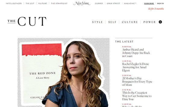
For example, let's say you're trying to bring art and fashion into the limelight. In this case, your website should look chic and forward-thinking without seeming pretentious. So, it might look a bit like The Cut. This digital magazine focuses on art and fashion, but it also provides insightful information about various topics that matter to its core demographic.

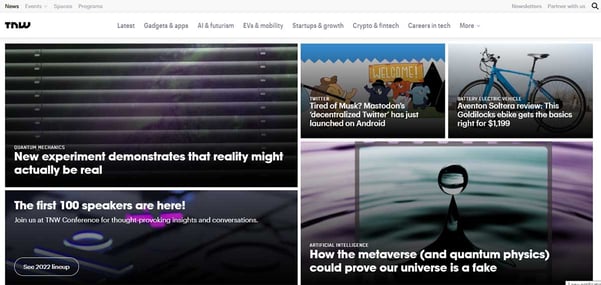
Another example might be The Next Web. As a tech-oriented publisher, TNW strives to be on the cutting edge, delivering news and information about the tech sector for both enthusiasts and professionals. So, the website utilizes a sleek, modern design that makes it easy to browse and discover new content.

Overall, website branding is a helpful tool for any business, but especially for online publishers. By following these tips, you can provide more value to your readers and, by extension, your affiliates. Because print publishing is hanging on for dear life, the switch to digital mediums is the wave of the future. So, without the right branding, you might be left behind.
Interested in building more sustainable visitor relationships and revenue?
Find out how Admiral's Visitor Relationship Management (VRM) Platform can help with:
- Paywalls, paid subscriptions, and donation campaigns
- Registration walls, first party data collection, and email signups
- Unlock your full ad stack with Admiral anti-adblocking tools
- Consent management for GDPR and CCPA
- Grow your social followers across Twitter, LinkedIn, TikTok, Instagram, and more


