

We’ve all heard the phrase: “A picture is worth a thousand words.”
And you might also have come across a snappy-sounding statistic that claims people retain 80% of the information they see, compared to just 20% of what they read and 10% of what they hear.
Whether or not either of those things is literally true (and, FYI, they’re probably not), it’s hard to deny that visual advertising techniques can help to convey our messaging more clearly and bring greater impact to our marketing. This is especially true for B2C marketing but can also be helpful for B2B businesses.
And when our campaigns cut through the noise and truly resonate with our target audience, we’re more likely to build stronger customer relationships and make money online.
But “visual marketing” isn’t about slapping a bunch of stock images over your blog posts or posting the occasional gif on social media.
Using visuals effectively requires planning and purpose.
You need to understand exactly what message you’re trying to communicate and the part that visual elements should play in conveying it.
Sounds complicated?
Don’t worry, because we’ve put together nine killer examples of frequently used advertising techniques in visual marketing to give you a little inspiration for your next campaign!
Technique #1: Summarize the Story With Visuals
Often, visual advertising techniques work well because they sum up complex themes or concepts in a way that’s simple for us to understand.
And, for many of us, it doesn’t get much more complex than the finer points of electoral politics!
In this visual marketing example, the Economist uses a banner at the top of an email newsletter to promote a special report on the German election:
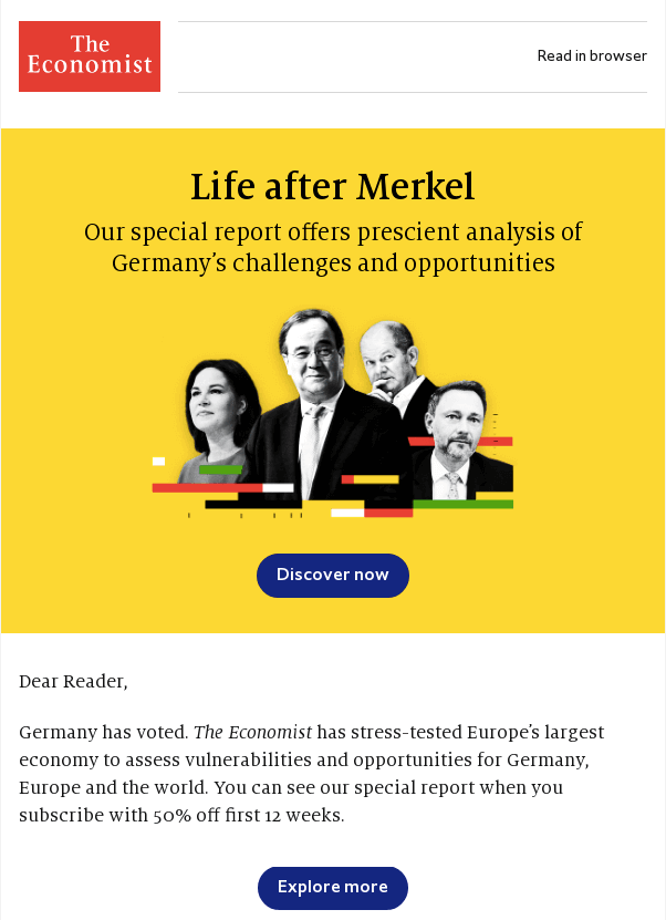
As you can see, it uses photos of the four main candidates, combined with visualizations of each party’s share of the vote, to sum up what’s going on in the newsletter.
Even without any words, there’s a good chance you’d understand what’s happening in this image, which really demonstrates the value of hiring a graphic designer!
That frees up space for the Economist to discuss its subscription offer — which is the ultimate goal of this email — without overwhelming the reader with a huge chunk of text.
Technique #2: The Rule of Thirds
The rule of thirds is a creative theory that claims visuals — whether art, digital ads, or webpages — are more interesting and engaging when the main focus falls on one of four intersecting points of a rule of thirds grid, or within a single section of one-third.
Like many things, it’s hard to explain in words, but much easier to sum up in visuals!
To leverage the rule of thirds, simply place a grid over your image, as HubSpot demonstrates here:

Your goal is to place the “interesting stuff” in your image at one of those four intersection points in the middle…

…or in one of the off-center “thirds:

Unsurprisingly, as a highly visual publication, National Geographic understands the rule of thirds and leverages it frequently — not just in its magazine and website imagery, but also to elevate its digital marketing.
In this social ad that appeared on Facebook and Instagram, the publisher placed the key visual elements at the very edge of the image:
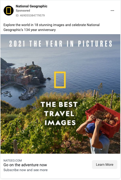
That meant the center ground remained free for its ad copy.
Technique #3: Color Theory
Color theory is about how different colors produce similar emotional responses from the majority of people. Depending on what industry your business is a part of, you would want to use different colors.
It explains why so many fast food brands use red and yellow — believed to make us feel hungry — in their branding.
Sortfolio has put together a helpful infographic to demonstrate how our moods, feelings, and emotions can be influenced by the rainbow color spectrum:
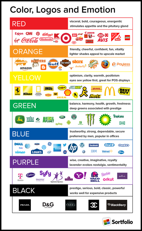
Find the right colors for your branding and marketing and you’ll be better able to drive action from consumers.
Combine it with highly impactful copy and you could even double your sales.
Color theory is one of TrustedHousesitters’ favorite advertising techniques.
When your whole business model is based on letting people into your home for extended periods to look after your pets while you’re away, trust is a huge factor.
If potential customers don’t think they can trust the service, it literally doesn’t have a business.
So the brand uses lots of blue hues to denote trustworthiness and dependability in its marketing:

That color palette also has a green undertone — used to suggest balance, harmony, and health
Again, those are all emotions that would make you feel reassured as a pet (and property) owner.
Technique #4: Testimonials In Email Marketing
Testimonials are a classic example of “social proof” — a term coined by psychologist and academic Robert Cialdini.
Cialdini used the phrase to describe the social and psychological phenomenon by which we copy the actions of other people in an effort to behave correctly in a given situation.
It’s why word of mouth is such a valuable marketing tactic.
And the same can be said of testimonials.
In a nutshell, testimonials are one of the most effective advertising techniques because they influence our actions.
It’s like: “If all these other people think Product X is amazing, maybe I should try it too.”
Email marketing is a smart platform for airing your testimonials, because you’re reaching people who are already somewhat engaged with your brand (at least, enough to give you their email address and sign up for the newsletter you create).
They work especially well in a visual format, as AllTrails demonstrates here:
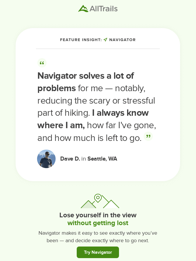
Image source: Really Good Emails
It makes sense to add a visual element here because it helps to demonstrate the fact that this testimonial is from a real person, rather than the result of a brainstorming session from the marketing team.
You could even add these types of testimonials to your homepage if you are a product or service provider like OZARK Armament:

That makes it much more impactful than just a few lines of copy.
Technique #5: Behind-the-Scenes Footage
Sticking with the theme of trust, there’s plenty of evidence to suggest that consumers don’t find ads particularly trustworthy.
In fact, research from Ipsos found that 69% of people distrust advertisements, while a study commissioned by the American Association of Advertising Agencies discovered that only 4% of consumers think advertisers and marketers act with integrity.
Ouch.
But this is definitely something you can address through your marketing.
One of the best advertising techniques to build trust is to show (believable) behind-the-scenes footage that lifts the lid on what things are really like at your organization.
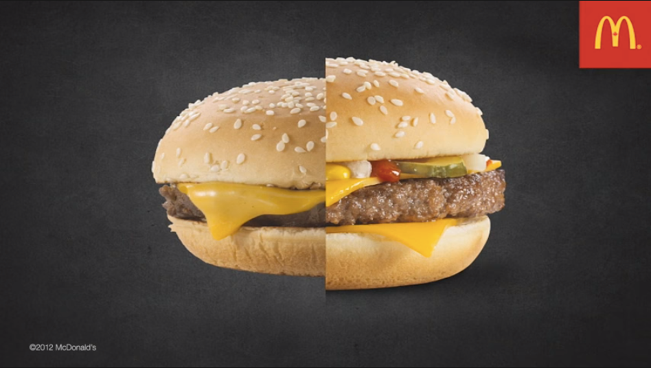
McDonald’s used this method to great effect.
Everyone knows McDonald’s — and every other food brand in the world, for that matter — makes its food look more appetizing in ads than it often looks in reality.
That’s not a crime, but it causes plenty of complaints (so many that rival fast food giant Burger King launched a whole marketing campaign around it).
To build trust in its product, Mickey D’s created a behind-the-scenes video demonstrating how it “dresses up” its burgers for ads.
It produced the following before-and-after shot, which effectively demonstrates that while the ad-friendly version (on the right) undoubtedly looks prettier, the “real thing” still looks pretty damn tasty…
Technique #6: The Focal Point
As with all advertising techniques, you’re not using visuals for the sake of it — you’re doing it to draw attention to a specific message.
However, sometimes the consumer needs a little subconscious “assistance” to hone in on the message you’re trying to convey.
To get around this, try adding a clear focal point to your imagery.
Typically, your focal point will lie at the center of your image, and will be highlighted by some type of visual cue — such as:
- Arrows
- Light and shade
- Contrasting colors
- Unusual shapes
- Reflections
In this example, the New Yorker uses the letters in its own name to… draw attention to its name (again, there’s no easy way to describe this in words, so just take a look for yourself):
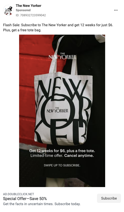
It’s doubly smart because the focal point falls within a tote bag, which was part of the New Yorker’s subscription offer at the time.
One thing to bear in mind here: by definition there should only be one focal point per image.
Try to pull the viewer’s attention in more than one direction at a time and you’ll effectively end up with no focal point, which makes for a cluttered and unclear ad.
Technique #7: Storytelling
Storytelling builds a connection with your audience, instills trust, and helps create positive associations with your brand.
It’s also one of the advertising techniques that works best in visual formats.
Naturally, telling a compelling story requires quite a lot of words.
And not everyone has the time or attention span to read 2,000 words of copy.
But if you tell your story through video rather than words, you can communicate the same message in a fraction of the time.
That’s precisely what the PGA Tour did in this social media ad, in which pro golfer Cameron Champ explained the importance of speaking out against racial injustice:

You can even use video within blog posts to leverage visual marketing. A video hosting service like StoryXpress or Loom could help you host and upload videos to the post.
Technique #8: Compel Users to Take Action
User experience and conversion rate specialists spend huge amounts of time figuring out how to drive the desired action from users.
That action could be to sign up to a newsletter, buy a product, start a free trial, or take out a subscription.
And once again, visual advertising techniques play a big role.
As we’ve seen from other examples, intelligent use of visuals can naturally draw the reader’s eye and highlight key messaging.
Here, we can see how the Washington Post uses call-to-action buttons to draw attention to its subscription offer:
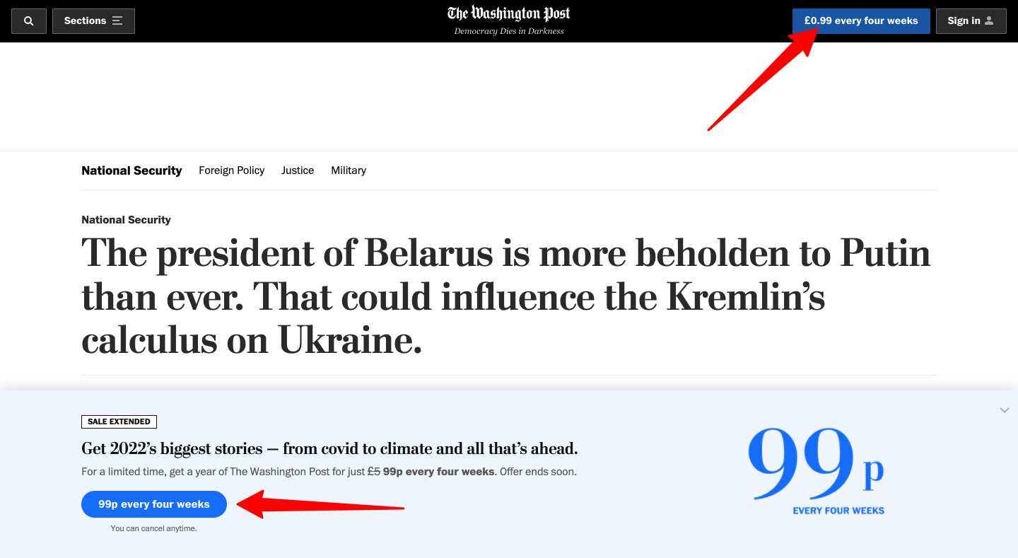
Despite their relatively small size, those buttons stand out clearly against WaPo’s black header and light blue bottom-of-the-page banner.
It’s no coincidence that the only other element on the page to share that color is the price in the bottom right corner.
That’s smart because it helps to highlight the value of the promotion.
Technique #9: Add Context to Your Copy
It’s not a case of words vs. images.
Intelligent brands make use of both in their visual marketing.
We’ve already seen how visuals can help to clarify difficult concepts that would be tricky to convey in words alone.
And they can also be used to add valuable context to your copy, just like Merriam-Webster does in its regular word of the day posts on Instagram:
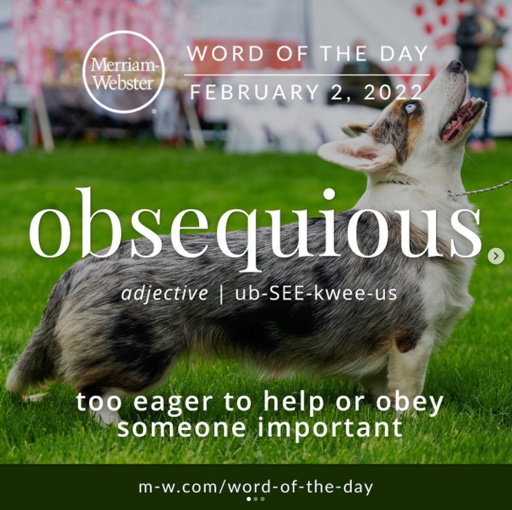
Image source: Merriam-Webster Instagram
This is a textbook example of copy and visuals working in harmony.
The copy explains the word of the day, while the image effectively visualizes the explanation.
Bringing It All Together
Want to know why visual advertising techniques often fall short?
Because the whole visual element is little more than an afterthought.
Marketers come up with a message, write some words, then desperately search for some half-relevant imagery to accompany it.
Or, even worse, they hand a finished concept over to a beleaguered graphic designer and ask them to make it look pretty.
That pretty much never works.
Visuals need to be at the forefront of any campaign.
That means you should be planning how your content will look at the ideation stage, not when you’re ready to hit “publish” or “send”.
Contributing Guest Author: Freya Laskowski
@freyalaskowski
Freya is a personal finance expert and founder of the CollectingCents website that teaches readers how to grow their passive income, save money, improve their credit score, and manage debt. She has been featured in publications like Business Insider, Fox Business, the Huffington Post, and GoBankingRates.


